Most interior designers win their work on personal brands as high-end tastemakers.
They build their identity as a confident signature of their style, use an elegant and airy serif; often a separate cursive of their name, and a minimalist cream palette.
It’s a powerful way to leverage a social-first system that rewards personal brand.
In the weeks from episode 1 to winning the final on BBC Interior Design Masters, Lia’s personal brand grew to over 15k followers. But we decided not to build an identity on her personal brand. Lia wants to create impactful spaces for hotels, restaurants, and brand experiences. That work is won or lost on a judgment call made long before a client reads your portfolio or takes your call.
To us, design is a science before it’s art. We break down the visual codes and psychological shortcuts of competitive categories to get brands recognised, instantly, for the qualities they need to succeed.
For Lia, the brief came down to defining a recognition problem: how do you make a designer whose fame is only weeks old read like she's always been established amongst the company of studios doing serious commercial work?
Lia Gold | BBC Interior Design Masters Winner
Why we chose not to build a personal brand for a primetime TV Star. A visual identity architected to earn commercial credibility and household status without the gift of reputation
The category has two looks, and each puts designers in a different categoryInterior designers have stylised their reputations into two distinct competitive spaces.
On one side, the residential and staging designers: use light airy and elegant serifs, beige and greige, their feeds built on mood. This is my personal touch. They signal refinement. But they’re also a trivialised luxury signal that says “personal operator” where one mark earns no more credibility than another.
On the other, the commercial studios trusted with commercial consequence; Kelly Wearstler. Yabu Pushelberg. AvroKO. David Collins Studio. Their wordmarks are bold and carry a fortified confidence. These are not declarations of taste. They are declarations of credibility; heritage, pedigree, stature, commercial weight, the visual grammar of a business you can trust with a budget and a brand.
These archetypes classify a designer into one of two rooms before they’ve had a chance to pitch a word.
For the work Lia wanted, the airy personal look would have quietly locked her out of the conversations she wanted to be in, no matter how good the work or the following behind her was.
What Lia had already builtyHere is the part that made the positioning honest rather than aspirational: by instinct, Lia already worked the way the commercial studios think.
Lia doesn't start a room with decoration. She starts with its purpose, she defines what the space is for, what it needs to make people feel to work. The result functions effortlessly because the human experience was planned first. That is what separates commercial design from personal taste. Lia had the substance of the commercial class. What she lacked was a brand that said that for her.
So we built an identity that communicated what the best-known interior designers in the country rewarded her for week after week, and coded it into every visual detail.
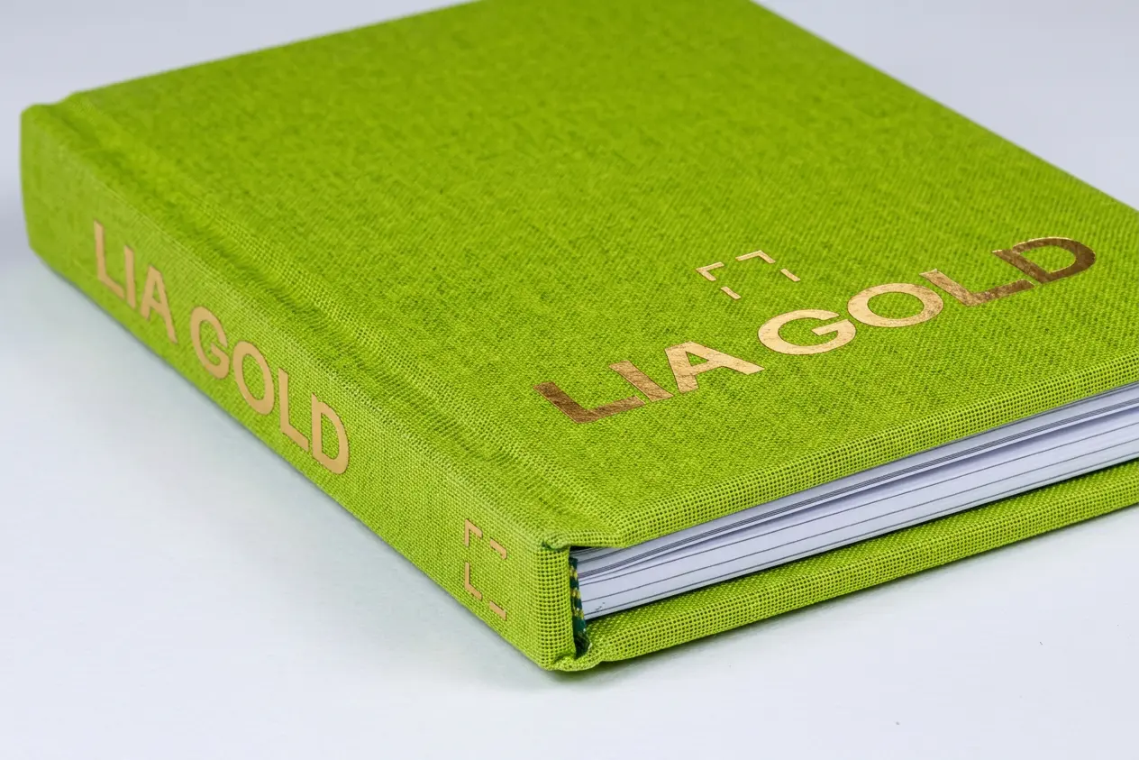
The decisionsA brand mark is judged in about a tenth of a second; in that instant, people form a verdict on competence and trustworthiness that barely moves when given longer to look. Each detail is engineered to make that snap judgment result in one idea: established operator.
Width reads as capability before it reads as size. Widened letterforms feel stable, calm, considered, and the eye treats generous space as time and care invested — and that time and care as money (By the same reflex, condensed type can feel hurried and cheap, or playful). We began with a typeface that already owned its space, widened it further, and tracked the capitals open. Two things happen at once: the word stops reading as text and becomes a single carved object, and the open spacing turns the natural loudness of capitals into calm authority.
Craft is read as competence, so we made the craft visible. Subtle, inscriptional detailing like the stone-cut tradition of classical Roman capitals imports two thousand years of permanence in a form the eye registers before the mind names it. For a designer of proud Italian heritage it is part of the story, not costume. And we designed details into some letters, not all. Restraint is its own stature signal: only a brand sure of itself can afford to under-decorate.
The contemporary "G" proves the heritage is a choice. Left completely modern, no serifs, a wide bowl stretched horizontally into a clean, engineered curve the eye reads as complete and quiet. This contrast makes a system feel deliberate rather than accidental, and this one contemporary form does the arguing: it tells the viewer the carved detailing elsewhere was chosen by the hand of a modern commercial designer fluent in the classical, not a nostalgist hiding in it. Permanence and modernity, in adjacent letters.
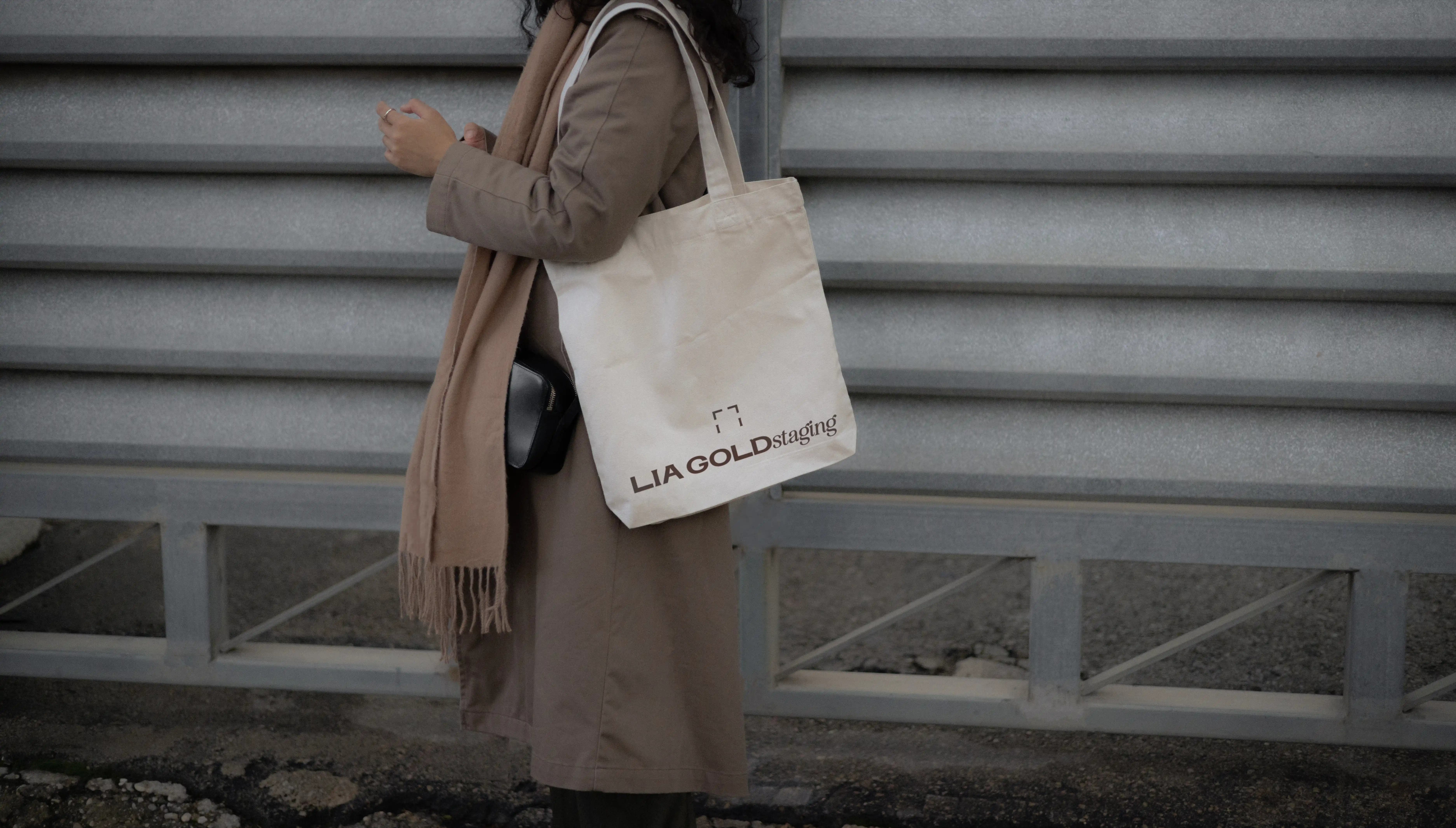
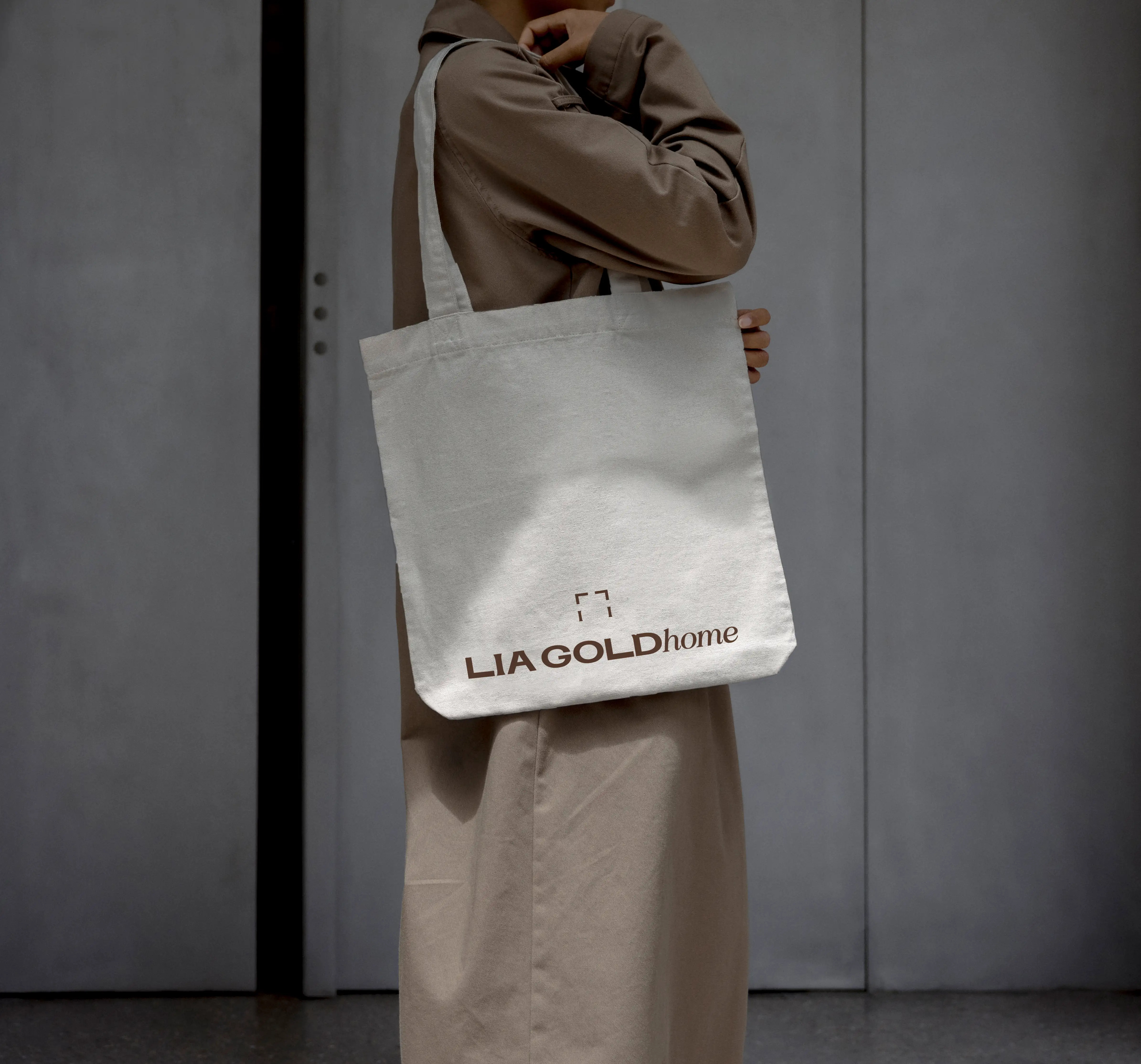
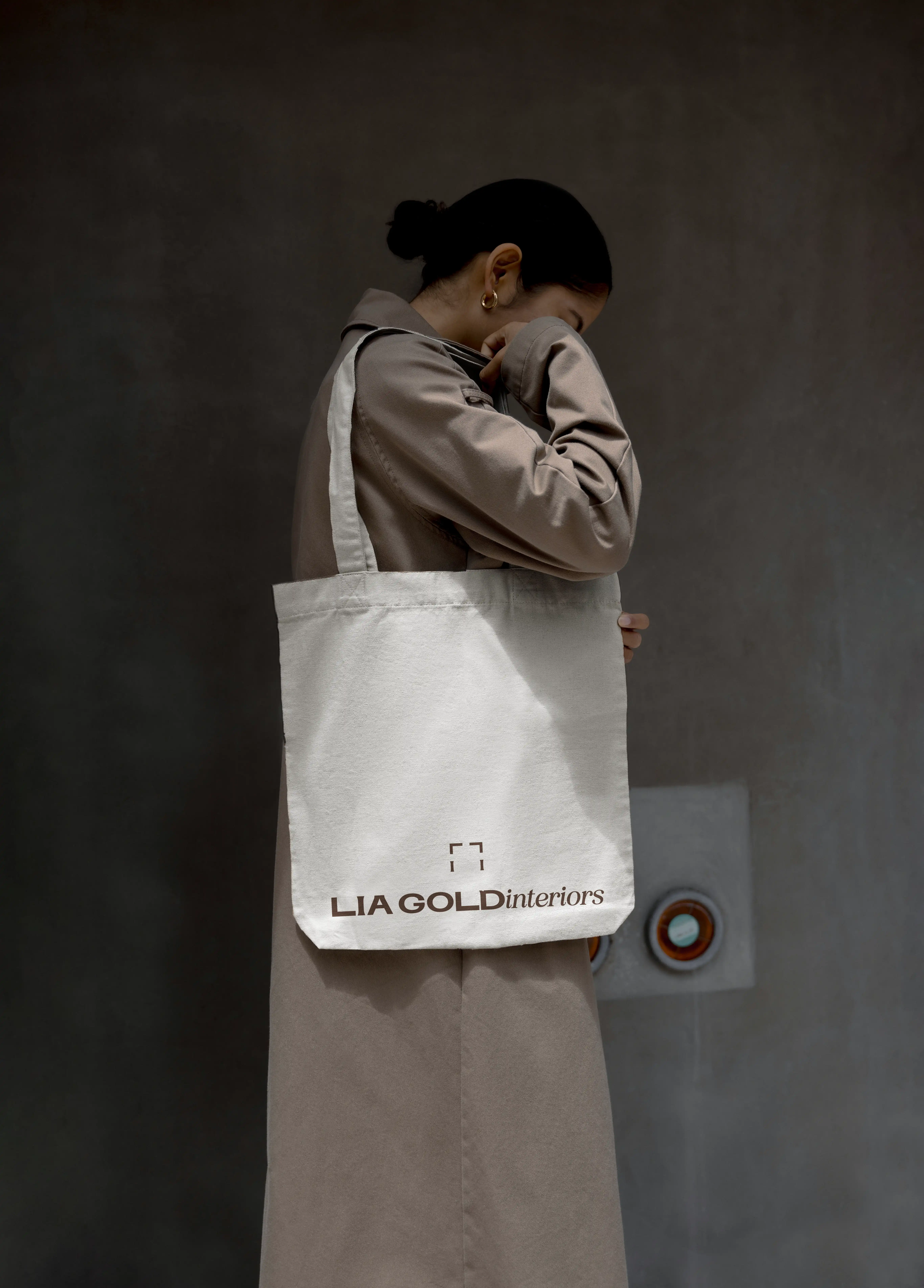
The device gives one person the grammar of an institution. Lia works in pattern and maximalism, so the identity needed a device bold enough to hold that energy and still read as serious. We abstracted the L and I into an architectural frame that behaves like the monogram of a luxury house: a seal of grandeur that stands alone or carries the sub-brands her name is already being pulled across. One designer, equipped to show up like an institution with commercial breadth.
We made the palette feel, not shout. The category default is beige, quiet luxury that blends in. We went the other way, the collection is warm, convivial, and deliberately bold. Reflecting the considered maximalism and intentional emotional variety that makes Lia’s spaces so impressive. Lia changed nothing and the palette was approved exactly as presented.
Width reads as capability before it reads as size. Widened letterforms feel stable, calm, considered, and the eye treats generous space as time and care invested — and that time and care as money (By the same reflex, condensed type can feel hurried and cheap, or playful). We began with a typeface that already owned its space, widened it further, and tracked the capitals open. Two things happen at once: the word stops reading as text and becomes a single carved object, and the open spacing turns the natural loudness of capitals into calm authority.
Craft is read as competence, so we made the craft visible. Subtle, inscriptional detailing like the stone-cut tradition of classical Roman capitals imports two thousand years of permanence in a form the eye registers before the mind names it. For a designer of proud Italian heritage it is part of the story, not costume. And we designed details into some letters, not all. Restraint is its own stature signal: only a brand sure of itself can afford to under-decorate.
The contemporary "G" proves the heritage is a choice. Left completely modern, no serifs, a wide bowl stretched horizontally into a clean, engineered curve the eye reads as complete and quiet. This contrast makes a system feel deliberate rather than accidental, and this one contemporary form does the arguing: it tells the viewer the carved detailing elsewhere was chosen by the hand of a modern commercial designer fluent in the classical, not a nostalgist hiding in it. Permanence and modernity, in adjacent letters.
The device gives one person the grammar of an institution. Lia works in pattern and maximalism, so the identity needed a device bold enough to hold that energy and still read as serious. We abstracted the L and I into an architectural frame that behaves like the monogram of a luxury house: a seal of grandeur that stands alone or carries the sub-brands her name is already being pulled across. One designer, equipped to show up like an institution with commercial breadth.
We made the palette feel, not shout. The category default is beige, quiet luxury that blends in. We went the other way, the collection is warm, convivial, and deliberately bold. Reflecting the considered maximalism and intentional emotional variety that makes Lia’s spaces so impressive. Lia changed nothing and the palette was approved exactly as presented.
What it became
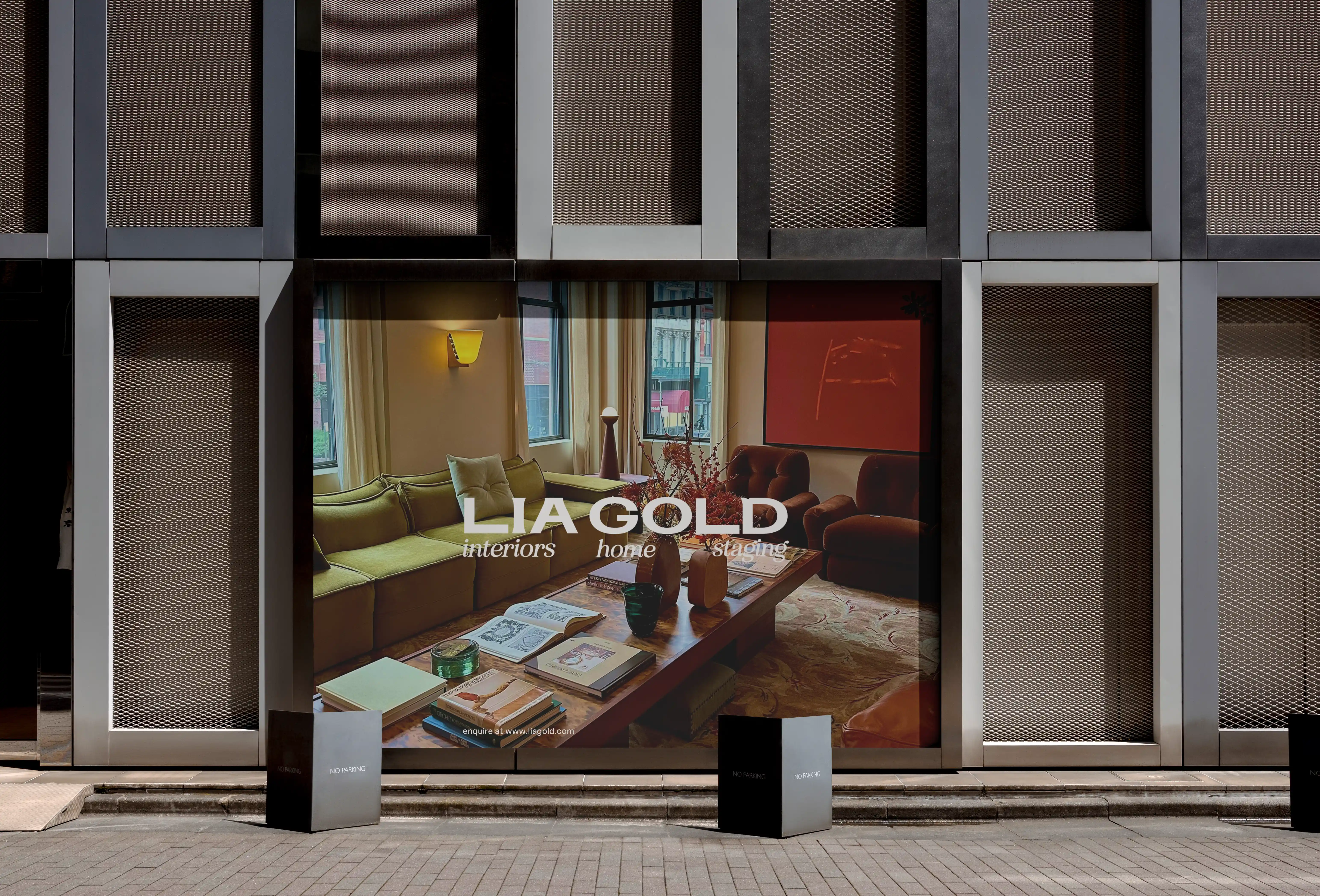
The mark now sits on thousands of products in Next stores across the country, carrying Lia's name into homes nationwide and has already earned offers from commercial studios. It sat behind her growing following as she was announced as the winner of BBC Interior Design Masters. It is already introducing her to the commercial clients she built it for.
It reads, in every room it enters, like Lia has always belonged there.
What this shows
We worked hard to dissect and define the smallest details of design decisions to architect form and find balance so the visual identity can hold a national retail line, a primetime final, and commercial credibility without a word needing to be said. That is how we build a visual identity at Mattermore: defining the qualities driving choice and loyalty and making them instantly visible.
The mark pre-paid the credibility Lia has genuinely earned but hasn't yet had the calendar time to accumulate, and fluently showcases her personality, style, skill and story.