Spahce
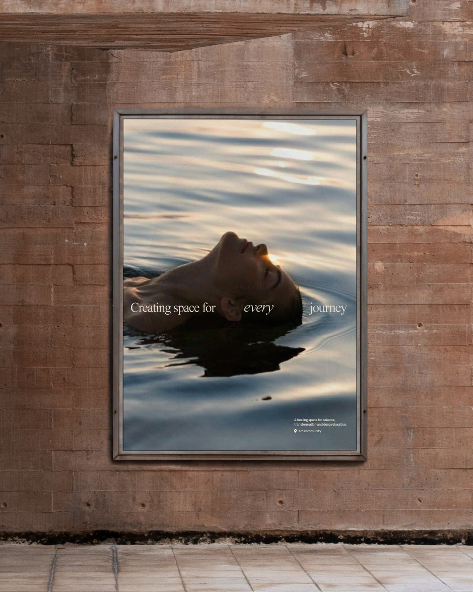
In a world chasing attention, we built a brand earning patience at every glance. By creating space for timeless techniques in busy lives, Spahce earned partnerships with London's scene-leading studios and a booked out schedule.
Challenge
Our always-on culture of overextension has turned self-care into another thing to do
Wider culture is pulling us, and we're letting it. 9 in 10 of us say we've felt extreme pressure this year, one in five say stress has pulled them into time off work. And we still find the time to spend 4.5 hours a day online.
And we know it's bad... Millenials are Gen Z are activey chasing "conscious deceleration", whilst more people than ever are meeting UK's advised activity thresholds.
But our culture of relentless excess broken how we think about our health too. Participation in Hyrox and Marathons is breaking records, there's an 1,676% rise in ultra-running globally.
And more definitively, we idolise this performance excess, on Strava, 93% of all trail and ultra-distance uploads receive "Kudos". That's the highest engagement rate of any category.
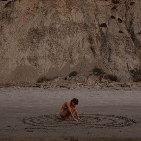
Self-care has become another thing we seek to excel at and do to excess. Spahce needed to interrupt that pattern. It had to make breath, texture, shadow and rhythm feel like the point — not decoration — so people could recognise rest, tactility and presence as forms of care in their own right.
And we know it's bad... Millenials are Gen Z are activey chasing "conscious deceleration", whilst more people than ever are meeting UK's advised activity thresholds.
But our culture of relentless excess broken how we think about our health too. Participation in Hyrox and Marathons is breaking records, there's an 1,676% rise in ultra-running globally.
And more definitively, we idolise this performance excess, on Strava, 93% of all trail and ultra-distance uploads receive "Kudos". That's the highest engagement rate of any category.
Self-care has become another thing we seek to excel at and do to excess. Spahce needed to interrupt that pattern. It had to make breath, texture, shadow and rhythm feel like the point — not decoration — so people could recognise rest, tactility and presence as forms of care in their own right.
Solution
Holding every scroll and glance long enough for an intentional breath
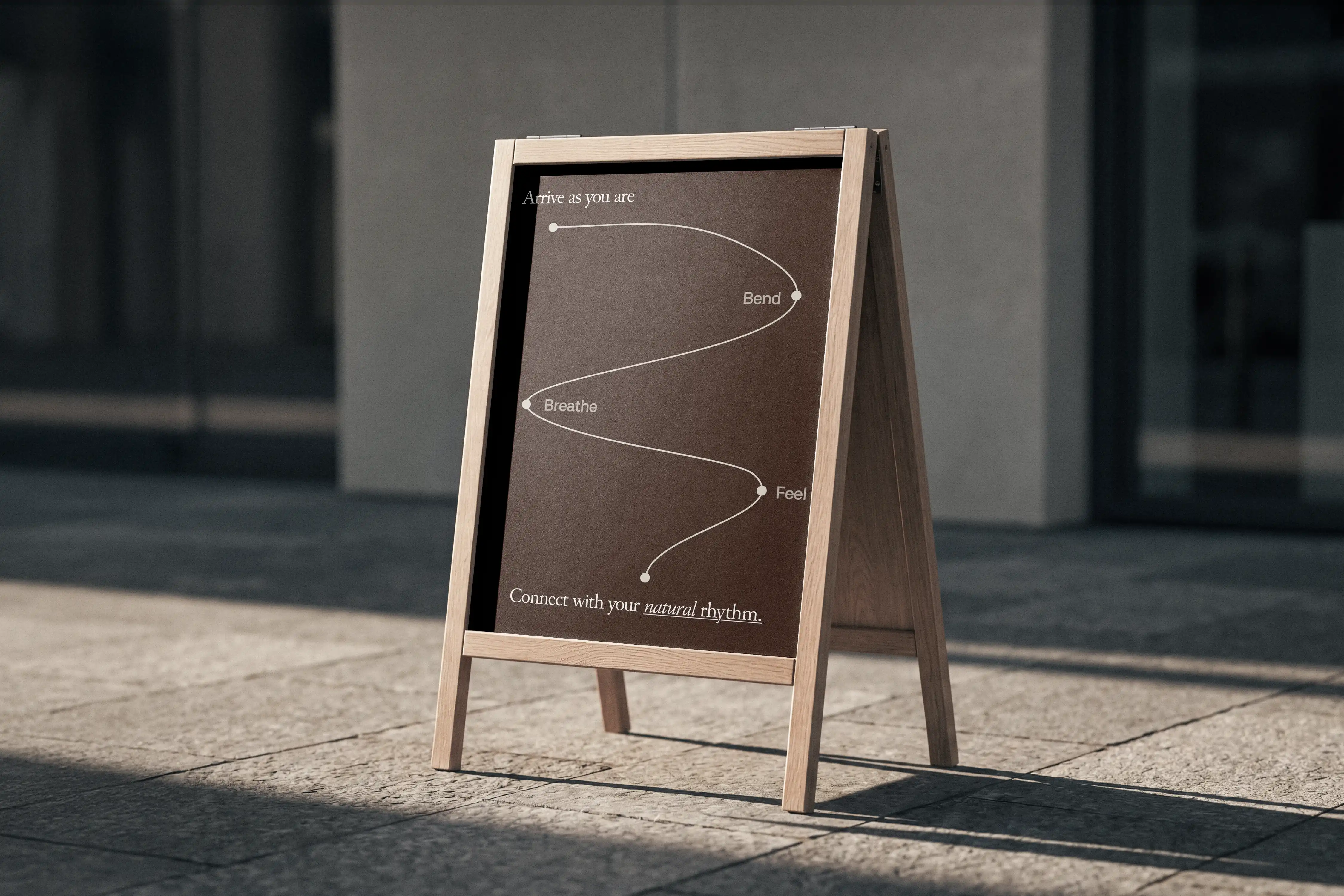
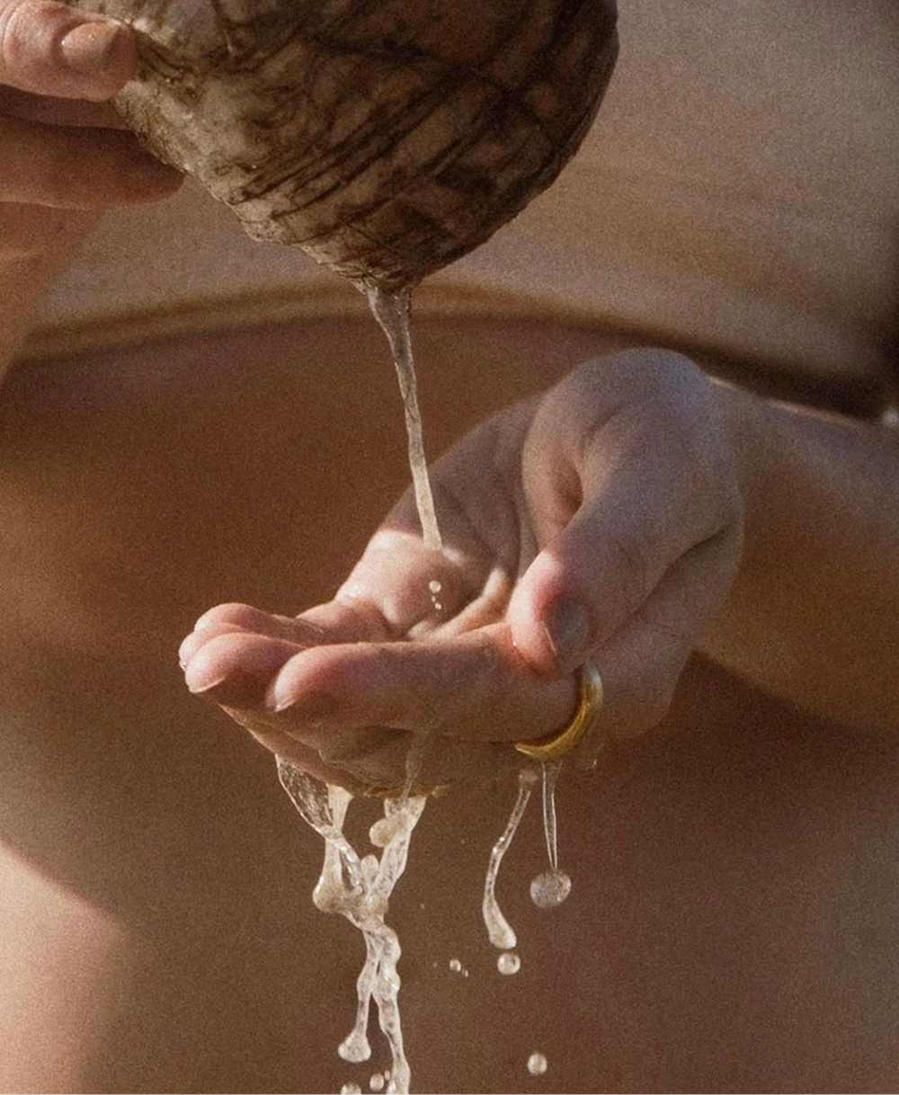
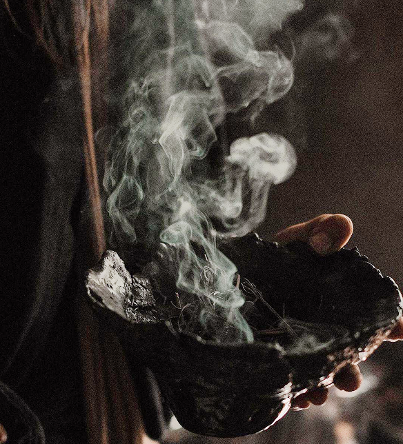
Spahce was built to ensure we slow down; bend, breathe and feel, with total connection. Through semiotic research and ethnography, we identified an opening for what we called tactile spirituality: a brand language built from sensory realism, quiet symbolism and restraint.
Signal by signal, we built the brand to earn patience at every glance. First, we focused on the experience; what we do focus on when we're wholly present, and what do we remember?
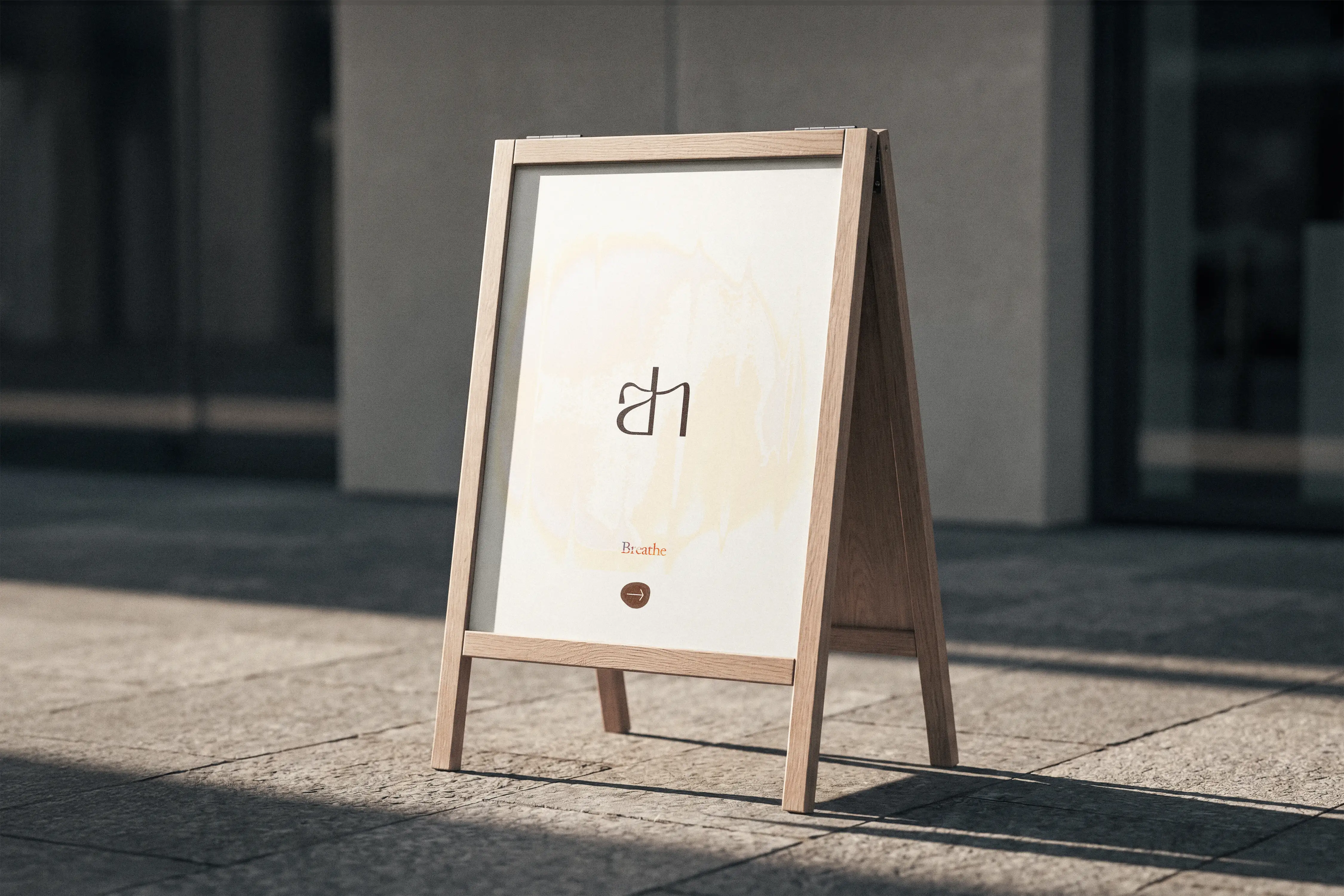
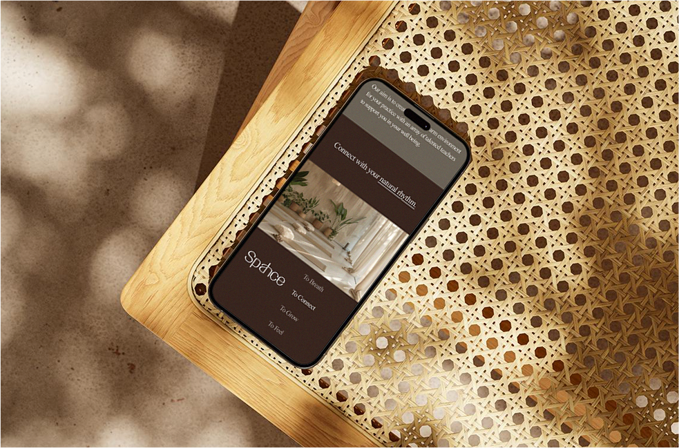
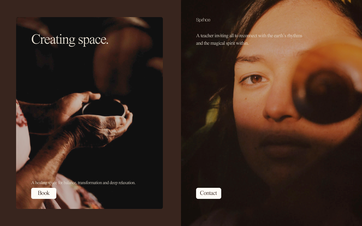
The name carried a somatic signal, including a-h; the sound of slow and intentional breathe, the custom typography built on Rajasthani arches, Mughal jharokhas and yogic bends. Every intimate curve designed to each hold attention just a little longer.
The wider brand leveraged partial portraiture, earthy colours inspired by Essaouira, the movements of the natural world; at once asking the audience to imagine tactility and focus on the importance of small details.
Signal by signal, we built the brand to earn patience at every glance. First, we focused on the experience; what we do focus on when we're wholly present, and what do we remember?
The name carried a somatic signal, including a-h; the sound of slow and intentional breathe, the custom typography built on Rajasthani arches, Mughal jharokhas and yogic bends. Every intimate curve designed to each hold attention just a little longer.
The wider brand leveraged partial portraiture, earthy colours inspired by Essaouira, the movements of the natural world; at once asking the audience to imagine tactility and focus on the importance of small details.


Results
By designing for patience, the brand became a sought-after practice
Spahce was born into a world designed to constantly acquire our complete attention, where movement is another competitive metric and we buy performative recovery wearables. The brand succeeded because it's intention met a deeper condition mirrored in anthropologies of ancient cultures all over the world.
The brand's system of felt-signals built moments long enough to feel patience. That patience createsd space for tactility, ritual and embodiment.
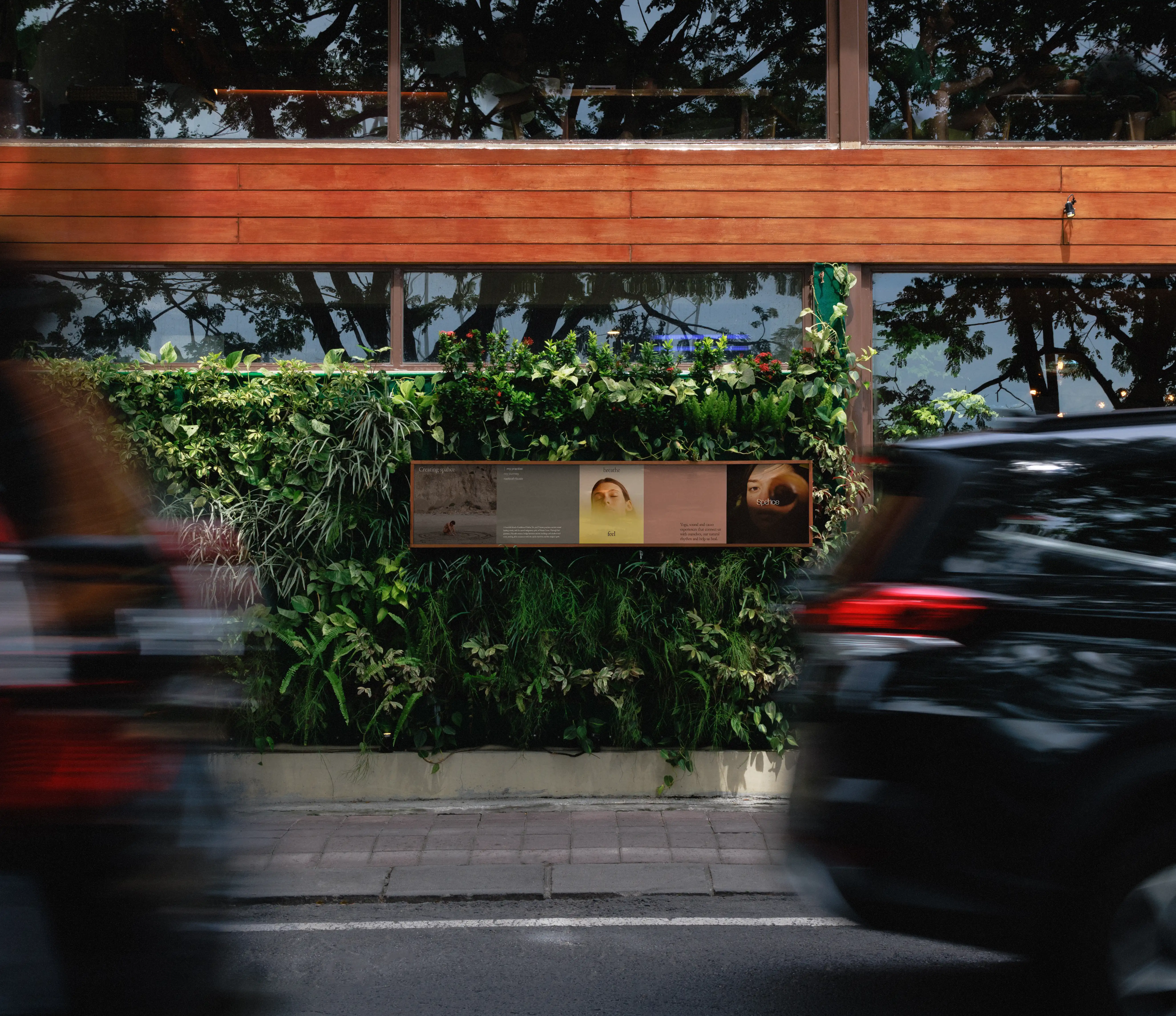
That felt experience matched its philosophy, and the market responded to the intention. The studio grew beyond it's space, being more than a place to gasp through poses the space for natural rhythm, depth and care became something other boutiques wanted. Spahce grew partnerships with London's scene-leading studios like arc community, significantly expanded it's offerings and reached 100% booking capacity within four months.
What began as a yoga and sound practice evolved into a broader destination for embodied care — proving that when a brand can slow people down, they don't just notice it. They stay long enough to bend, breathe and feel.
The brand's system of felt-signals built moments long enough to feel patience. That patience createsd space for tactility, ritual and embodiment.
That felt experience matched its philosophy, and the market responded to the intention. The studio grew beyond it's space, being more than a place to gasp through poses the space for natural rhythm, depth and care became something other boutiques wanted. Spahce grew partnerships with London's scene-leading studios like arc community, significantly expanded it's offerings and reached 100% booking capacity within four months.
What began as a yoga and sound practice evolved into a broader destination for embodied care — proving that when a brand can slow people down, they don't just notice it. They stay long enough to bend, breathe and feel.