Building the brand Brokers want to present
Onda invested in exclusive capabilities, designed to bridge the technical illiteracy gap that stalls the growth of innovators, but their investmenst weren't delivering growth. We drove international expansion and record-deals without marketing spend.
Challenge
Beacuse only 4% of brokers feel confident discussing technical detail, innovators sit in the shadows of trusted incumbents who win on price competition.
Everything Onda expected to drive broker share wasn't impacting choice. They had already invested in unmatched technical capabilities, a rebrand and content production systems. But brokers were still hard to persuade and adoption kept stalling. Onda had diagnosed this as “messy” documentation, inconsistent brand application and website issues.
Brokers place over 80% of UK commercial insurance, so broker choice is definitive for brand growth. And it is not a small decision, you can't try an MGA. You have to learn the policies, capabilities, market, limitations, and then the sales and onboarding processes. So brokers are staking their short- and medium-term income on long-term outcome potential.
On research, Onda's functional difference was deeply impressive, uniquely making it easier for end-clients to manage and adapt to risk, and with cost savings. But it wasn’t affecting sales. We discovered that it couldn’t: 85% of brokers say they aren't confident discussing cyber with clients, and only 4% describe themselves as very confident. An advantage the seller can't explain isn’t something that will sell, making the cold start risk nearly unpalatable.
Meanwhile the market research showed the whole category was selling "simple, fast, easy" to end clients, who aren't the people choosing. When a genre has been designed with the wrong, redecorating it doesn't help. So, broker share was dominated by aged incumbents with implicit value.
So, brokers had little grounds to present Onda, when they did, our customer experience audit showed processes were designed as if only for a technical audience, in the real-world it needs to be quickly passed back-and-forward by brokers, technology teams and layman buyers, creating deep friction in a system that already’s already hindered by poor fluency.
Brokers place over 80% of UK commercial insurance, so broker choice is definitive for brand growth. And it is not a small decision, you can't try an MGA. You have to learn the policies, capabilities, market, limitations, and then the sales and onboarding processes. So brokers are staking their short- and medium-term income on long-term outcome potential.
On research, Onda's functional difference was deeply impressive, uniquely making it easier for end-clients to manage and adapt to risk, and with cost savings. But it wasn’t affecting sales. We discovered that it couldn’t: 85% of brokers say they aren't confident discussing cyber with clients, and only 4% describe themselves as very confident. An advantage the seller can't explain isn’t something that will sell, making the cold start risk nearly unpalatable.
Meanwhile the market research showed the whole category was selling "simple, fast, easy" to end clients, who aren't the people choosing. When a genre has been designed with the wrong, redecorating it doesn't help. So, broker share was dominated by aged incumbents with implicit value.
So, brokers had little grounds to present Onda, when they did, our customer experience audit showed processes were designed as if only for a technical audience, in the real-world it needs to be quickly passed back-and-forward by brokers, technology teams and layman buyers, creating deep friction in a system that already’s already hindered by poor fluency.
"Before the project, Onda had a strong underlying proposition, but our external perception didn't reflect it."
Stuart McMillan, Onda

Solution
Designing to predictably drive choice and loyalty when capability and comparison can’t
We ran our Full-Circle Buying Psychology model: watch real behaviour where the decision happens, isolate the levers actually driving it, then rebuild the experience around those signals. That meant broker conversations, interviews with Onda's sales leadership and people who had brokered elsewhere, walk-throughs of the live journey and documents, and a full scan of the category.
We knew the lever wasn’t rational, if brokers can't assess the technology, then they decide the way everyone decides when they can't verify something: on how it looks, how it reads, how it feels to use, and what presenting it says about them. When quality is hard to judge, people substitute visible effort and consistency for it, an effect that gets stronger the harder the judgement is.
So, Onda had to feel like a serious, defensible and mature operator. Brokers wanted to strengthen their reputation, move quickly and feel confident that clients would recognise a defensible choice presented by a well-informed partner. So we took what was already true about the product and made it the outward experience. Trust that the experts on your team can collaborate, understand and adapt in real-time.
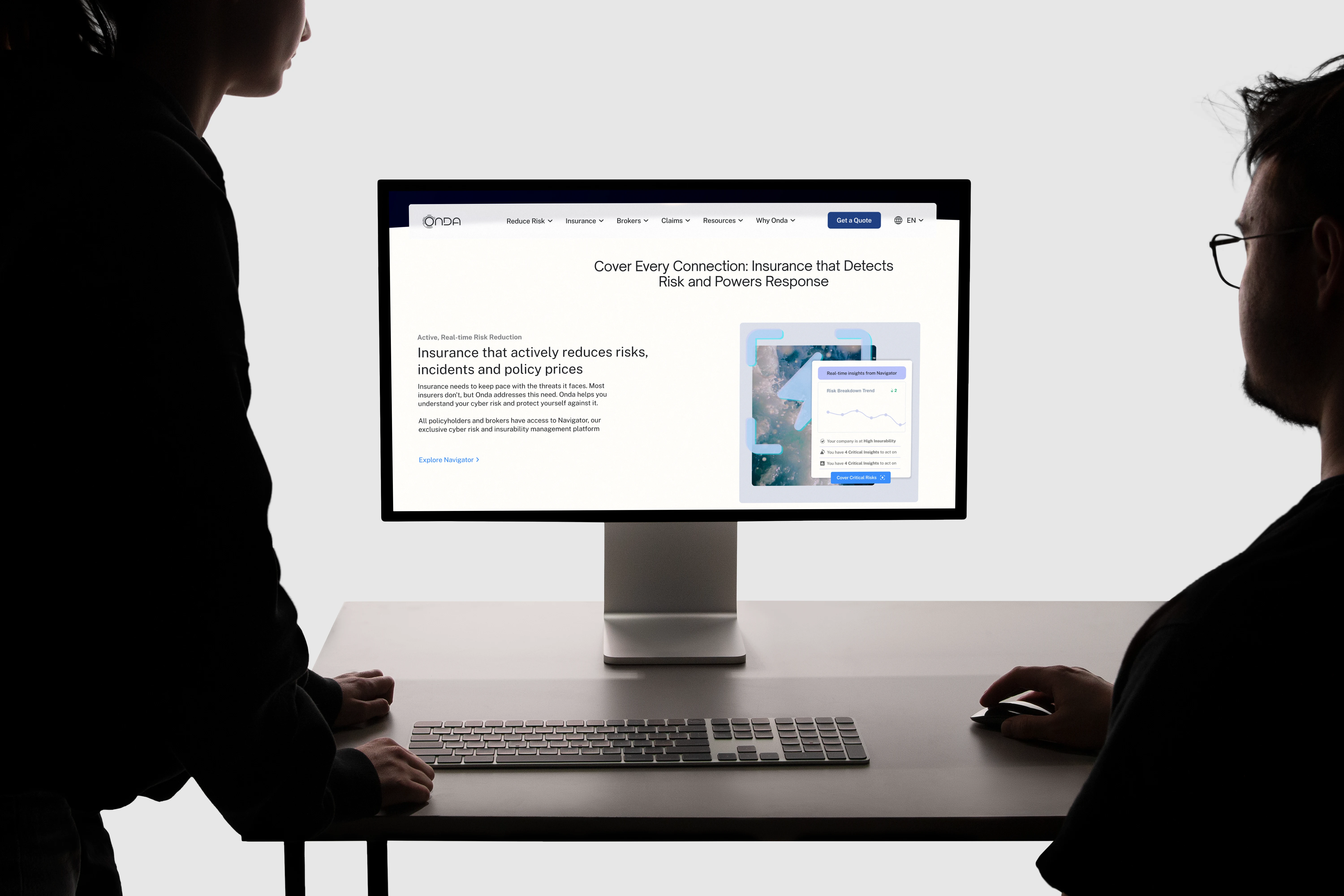
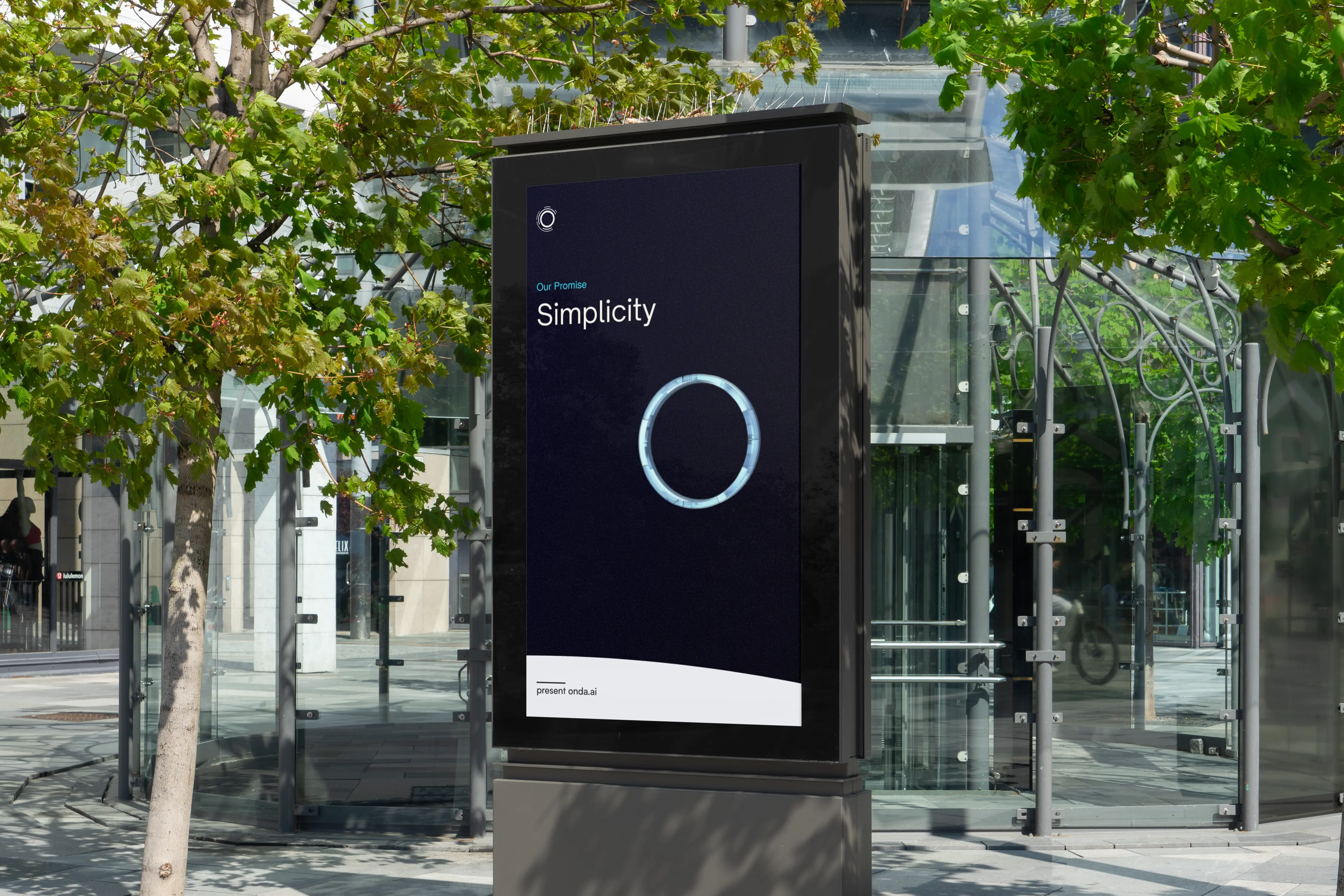
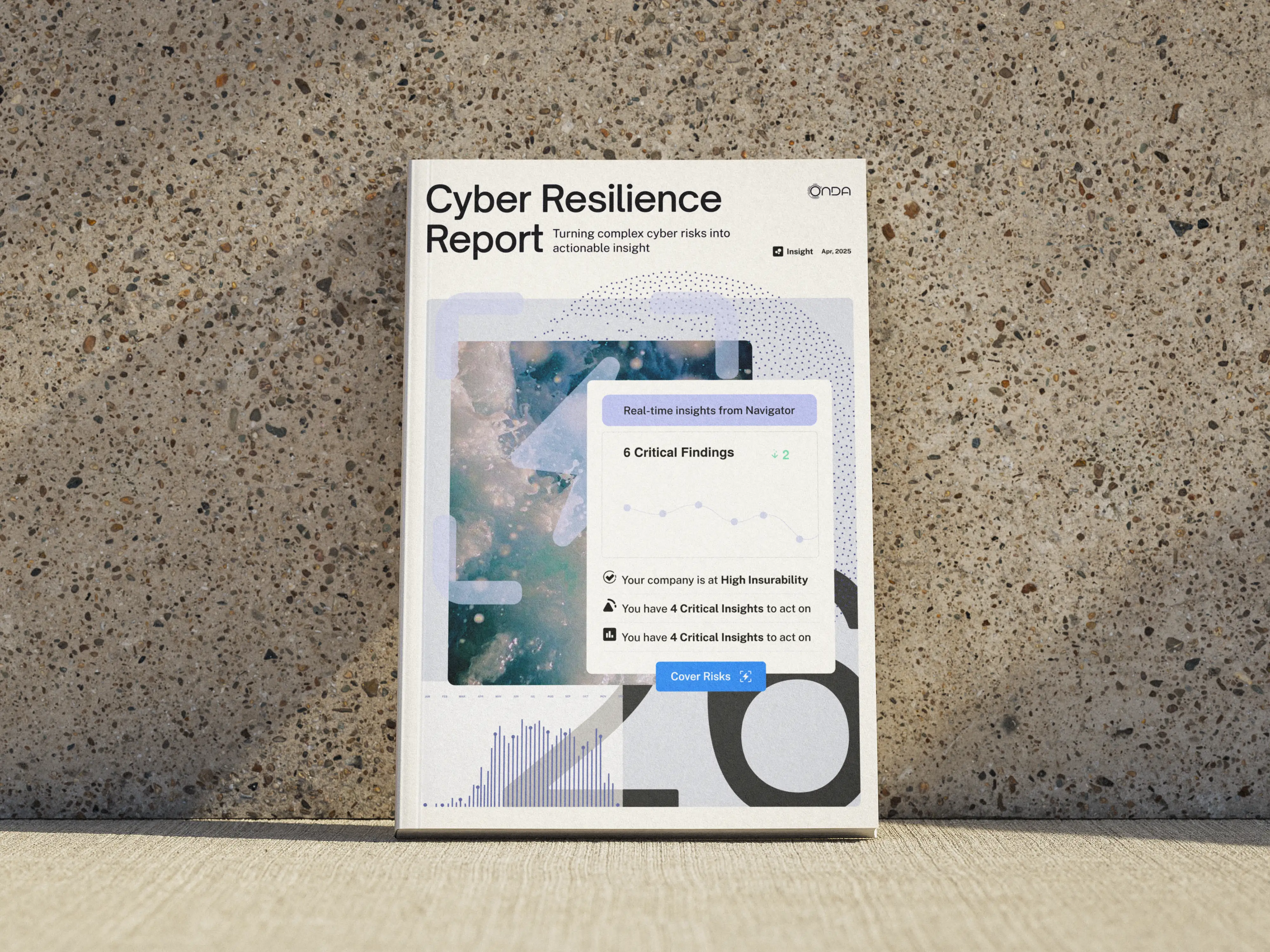
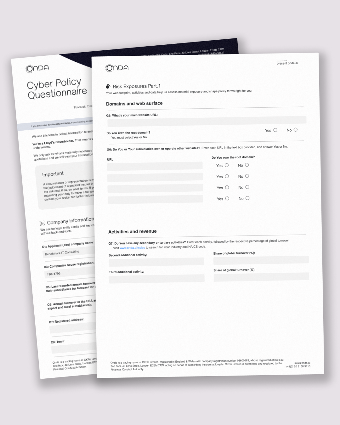
We built a brand and customer experience that was designed to live in its smallest details, communicating capability, relentless detail and minute consistency at every touchpoint. Alongside Onda’s sales leadership we built internal and external sales enablement solutions that could scale across territories and subject matter, all built with the same feeling of intent and flexibility that supports brokers in their day to day.
We knew the lever wasn’t rational, if brokers can't assess the technology, then they decide the way everyone decides when they can't verify something: on how it looks, how it reads, how it feels to use, and what presenting it says about them. When quality is hard to judge, people substitute visible effort and consistency for it, an effect that gets stronger the harder the judgement is.
So, Onda had to feel like a serious, defensible and mature operator. Brokers wanted to strengthen their reputation, move quickly and feel confident that clients would recognise a defensible choice presented by a well-informed partner. So we took what was already true about the product and made it the outward experience. Trust that the experts on your team can collaborate, understand and adapt in real-time.
We built a brand and customer experience that was designed to live in its smallest details, communicating capability, relentless detail and minute consistency at every touchpoint. Alongside Onda’s sales leadership we built internal and external sales enablement solutions that could scale across territories and subject matter, all built with the same feeling of intent and flexibility that supports brokers in their day to day.
"Working with Joey was a genuinely valuable experience. What struck me most was how quickly he understood not just the aesthetics, but the nature of our business and the audience we're speaking to. "
Stuart McMillan, Onda
Results
A brand and customer experience delviering broker share without spending more on marketing
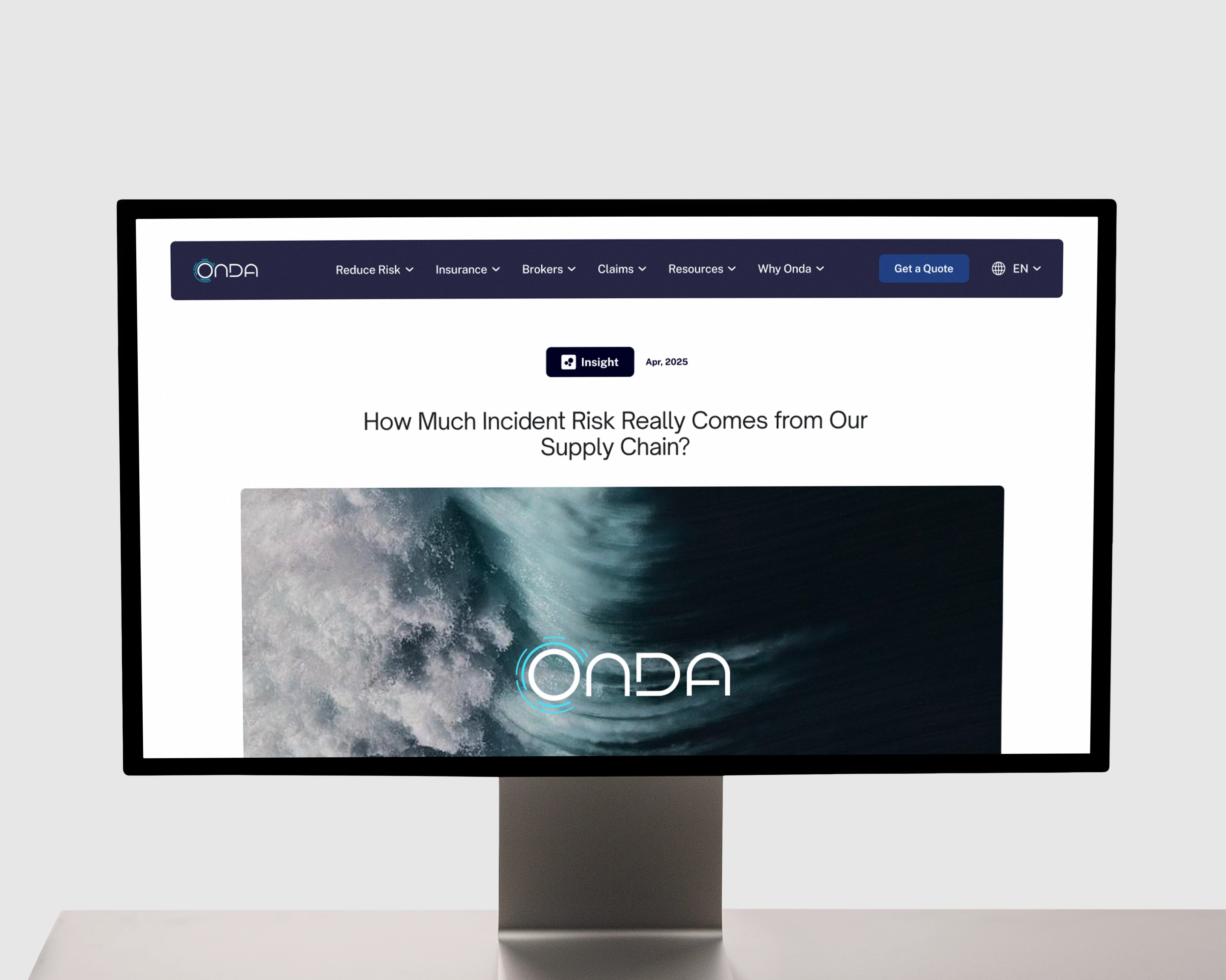
Within weeks after launch, organic feedback had already arrived. Brokers were recognising Onda as a brand that could be trusted before it really needed to explain why.
The Sales Enablement team are able to rapidly produce content that helps brokers and buyers react to changes in the threat landscape and scalably deliver thought leadership and expertise across markets that's fuelling rapid international expansion. This consistent and meaningful execution brand-building is expanding a recognisable awareness layer and reinforcing a reason to present Onda that outweighs the familiarity of the sector's global incumbents.
Onda now appears like a mature and established operator not just to brokers and end-clients, but also to enterprise partners, supporting technology and insurance capability expansion.
By year-end, Onda had broken its own record deal size repeatedly. With deals flowing at faster pace, alongside a promotion for the Distribution Director to Chief Commercial Officer and rapid expansion into the United States.
The Sales Enablement team are able to rapidly produce content that helps brokers and buyers react to changes in the threat landscape and scalably deliver thought leadership and expertise across markets that's fuelling rapid international expansion. This consistent and meaningful execution brand-building is expanding a recognisable awareness layer and reinforcing a reason to present Onda that outweighs the familiarity of the sector's global incumbents.
Onda now appears like a mature and established operator not just to brokers and end-clients, but also to enterprise partners, supporting technology and insurance capability expansion.
By year-end, Onda had broken its own record deal size repeatedly. With deals flowing at faster pace, alongside a promotion for the Distribution Director to Chief Commercial Officer and rapid expansion into the United States.
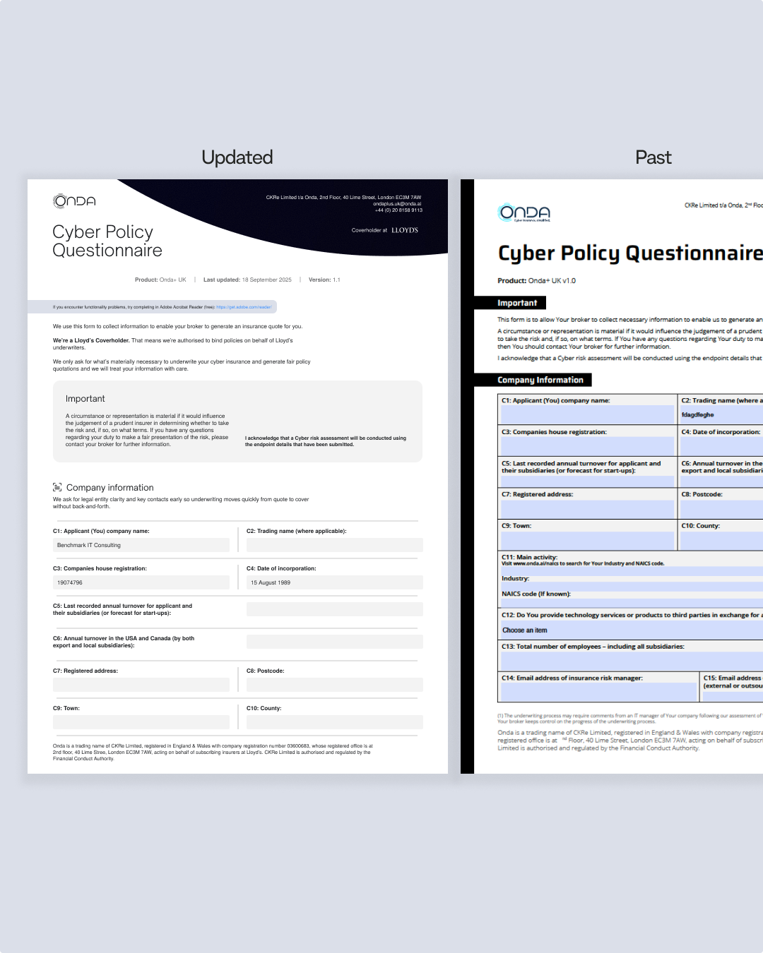
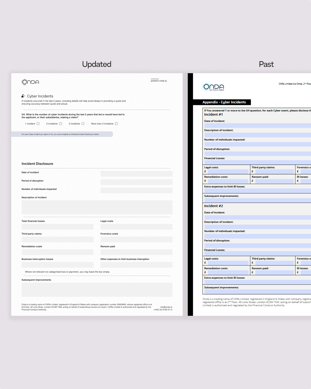
"One moment that stood out came a few weeks after launch, when a broker mentioned unprompted that our documents felt "more serious" - in the best sense.
Brokers have picked up on it too; we've had comments about how much sharper our materials look. It's one of those changes that's hard to quantify but very easy to feel."
Brokers have picked up on it too; we've had comments about how much sharper our materials look. It's one of those changes that's hard to quantify but very easy to feel."
Stuart McMillan, Onda
Working with Joey was a genuinely valuable experience. What struck me most was how quickly he understood not just the aesthetics, but the nature of our business and the audience we're speaking to. Since the project, I've noticed a shift in how confidently the team presents Onda - there's a cohesion now that simply wasn't there before.
Brokers have picked up on it too; we've had comments about how much sharper our materials look. It's one of those changes that's hard to quantify but very easy to feel.
Brokers have picked up on it too; we've had comments about how much sharper our materials look. It's one of those changes that's hard to quantify but very easy to feel.
Before the project, Onda had a strong underlying proposition, but our external presentation didn't fully reflect it. This made it harder for brokers to quickly understand what differentiated us.
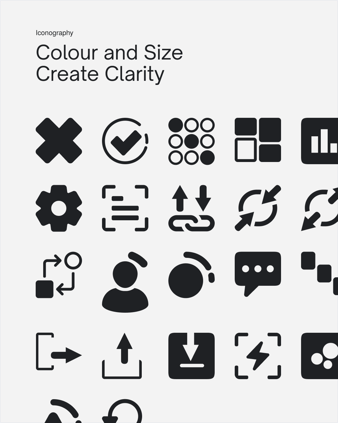
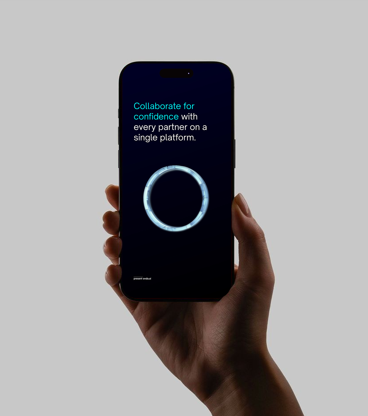
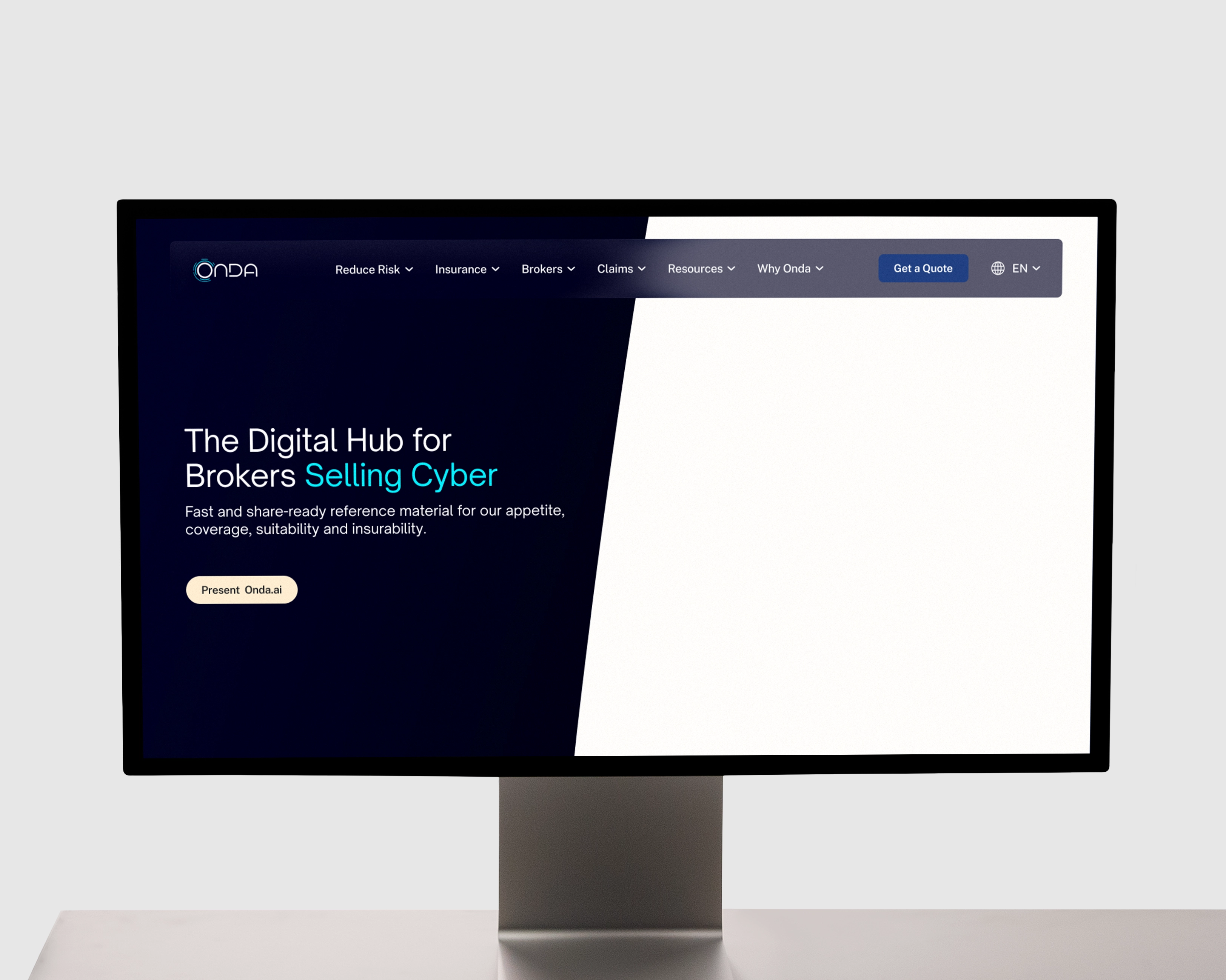
The brand evolution brought much greater clarity and structure to how we communicate. There is now a defined story and vision behind the brand, along with clear guidance on core elements - colour, iconography, tone. Each colour has a purpose, and a structured icon set has made it easier to convey key ideas consistently across touchpoints.
One moment that stood out came a few weeks after launch, when a broker mentioned unprompted that our documents felt "more serious" - in the best sense. That kind of organic feedback is hard to manufacture and suggested the changes were landing in the right way with exactly the right audience. Internally, the shift has been just as meaningful. The team now has a clear framework to follow, which has noticeably improved both the speed and quality of producing broker-facing materials. What used to require several rounds of back-and-forth to get right now moves much more efficiently.
The brand evolution brought much greater clarity and structure to how we communicate. There is now a defined story and vision behind the brand, along with clear guidance on core elements - colour, iconography, tone. Each colour has a purpose, and a structured icon set has made it easier to convey key ideas consistently across touchpoints.
One moment that stood out came a few weeks after launch, when a broker mentioned unprompted that our documents felt "more serious" - in the best sense. That kind of organic feedback is hard to manufacture and suggested the changes were landing in the right way with exactly the right audience. Internally, the shift has been just as meaningful. The team now has a clear framework to follow, which has noticeably improved both the speed and quality of producing broker-facing materials. What used to require several rounds of back-and-forth to get right now moves much more efficiently.
From a commercial perspective, the updated brand reflects the strength of our product and technology, and gives us a more confident presence in broker conversations, which ultimately is where it matters most.
The project has helped align how Onda looks, communicates, and operates with the strength of what we're building. That alignment has made a meaningful difference, both for the team and for how we show up in the market.
The project has helped align how Onda looks, communicates, and operates with the strength of what we're building. That alignment has made a meaningful difference, both for the team and for how we show up in the market.
Stuart McMillan, Onda